Hello, Excellers. Welcome to another blog post in my Excel series. Today I will show you how to create a fun Excel Waffle Chart. Unfortunately, Excel does not have a Waffle chart in the charting menu. However, it is straightforward to develop in a few steps. Once created, you can re-use the framework over and over again.
Tutorial Contents.
What Is A Waffle Chart?. An Introduction.
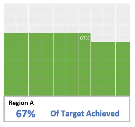
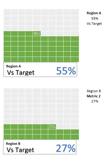
A waffle chart is a great and straightforward representation of progress towards a goal. Commonly used to display simple metrics, it is a ten by ten grid, and the whole chart represents 100%. Each square in the grid represents 1% of the entire chart. Below is an example of a waffle chart. The chart is dynamic as it will change as the metric is changed. These waffle charts are straightforward to read and interpret by users. I will show you how to build the waffle chart below. It’s cute, isn’t it?.
What Can I Use The Chart For?
Waffle charts can be used to visually display in Excel reports or dashboards how far from a metric is away from a target. They are easy to create, maintain and interpret. If you have a few metrics to display you can also set them side by side to create a great visualization of your metrics on an Excel report or dashboard. They really are versatile.
Create The Waffle Chart Framework.
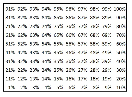
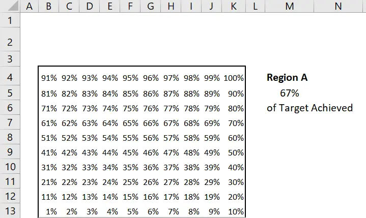
The first stage in the process is to create the Waffle framework. It makes up the ten by ten cell grid to give us 100 Excel cells within the chart. The height and width should be the same. The cells should run from 1% to 100%.
A speedy way to populate these cells is to complete the first two rows, go ahead and select both rows. Then, finally, drag the numbers to the top of the grid..
Create Metric Cell.
Next, a metric cell is required. This cell will contain the value of the target achieved, which will be linked to the chart later on in the process. In my example, I have selected cell M5 to contain the percentage metric. I have also prepared some of the data labels to be near the metric to be used for data labels later in the process. These are “Region” and “of Target Achieved”.
Apply The Conditional Formatting.
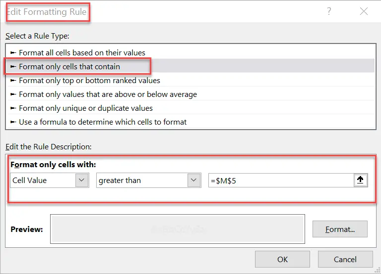
This is where the magic starts to happen. Or, where the conditional formatting is applied to the framework created in the previous step. There are two parts to the formatting. The cells that are less than or equal to the metric cell, and the cells that are greater than the metric cell. Finally, the cell in the waffle grid that represents the actual metric value will be conditionally formatted to have some star quality and stand out from the Waffle chart grid.
Format Cells Less Than Or Equal To The Metric cell.
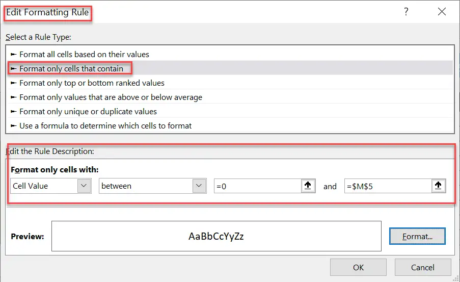
So, the conditional formatting is simple. Select the whole Waffle chart grid. Then follow the steps below.
- Home Tab | Styles Group | Conditional Formatting
- New Rule | Format cells that contain
- Format only cells with | Cell Value | Between = 0 | and =$M$5
- Select Format and choose your preferred formatting type
- I have formatted the cell colour the same as the font colour, which nicely hides the grid
Format Cells Greater Than The Metric Cell.
- Home Tab | Styles Group | Conditional Formatting
- New Rule | Format cells that contain
- Format only cells with | Cell Value | > $M$5
- Select Format and choose your preferred formatting type
- Again I have I have formatted the cell colour the same as the font colour, which nicely hides the grid
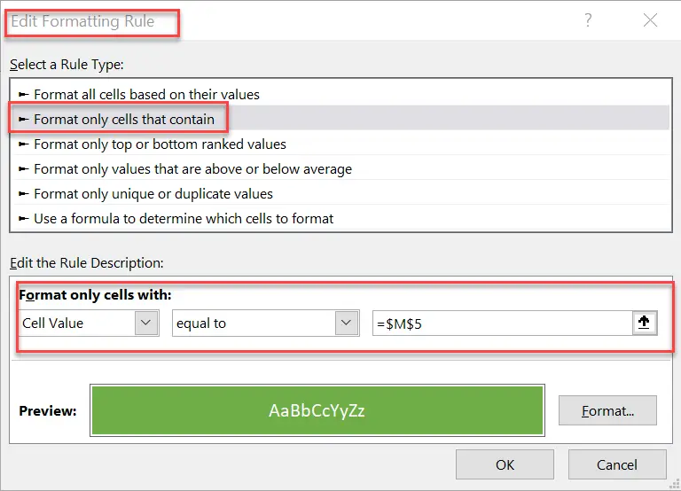
Last Formatting Part- Format The Cell That Is Equal To The Metric Cell.
I believe that this last part of the conditional formatting takes the waffle chart to a new level. The waffle chart gets a little pop by formatting the cell that contains the same value and the metric. So, follow the steps below.
- Home Tab | Styles Group | Conditional Formatting
- New Rule | Format cells that contain
- Format only cells with | Cell Value | = $M$5
- Select Format and choose your preferred formatting type
- I selected to format the font white in the cell, which matches the metric value
Using Text Boxes To Finish The Look.
To finish the waffle chart, you can add a text box or two to give the user more information. I have created three text boxes that link to the cells that contain the metric data. In this example, the first text box links to cell M4, which contains the Region name. The second text box I have connected to cell M5, which displays the current metric. The final text box links to cell M6 with clarification to the user the percentage is versus target. To link a text box to a cell in Excel is simple. Follow the steps below.
- Insert your Text Excel workbook, Insert | Text | Textbox
- Select the text box then in formula bar type = and then the cell reference you need
Now the text box references the cell. If the value or contents of the cell change, so does the text box.
Multiple Charts Or Multiple Series On The Waffle Chart?.
Waffle charts are a great way to visualize multiple metrics. Just align a set of them together to create a concise Excel dashboard. Create copies of your first Waffle chart and align your formatting and text cell links to the new metrics. Job done.
So, What Next? Want More Tips?

