Happy Friday Excellers, welcome back to another blog post my #formulafriday blog series. Are you looking to add custom data labels to your Excel chart? Maybe you want to add the title of a song or the name of a magazine. Whatever the reason, it’s easy to do as long as you know how to use formulas. In this blog post, we’ll show you how to add custom data labels using formulas. We’ll also provide some tips on how to make sure your data labels look great on your chart. So, today let’s have a look at using a few types of formulas to add some really cool customised data labels to our Excel charts.
Why Use Excel Chart Labels?
Chart labels can help clarify the message you want to communicate within your data to your audiences. Consequently, you may want to add even more information to them and get some added value without over cluttering your chart.
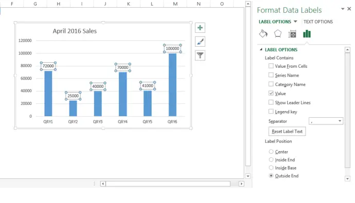
The chart in our example shows April 2016 Sales Values for the six products we sell. So we can see our sales values for April 2016, but not much more.

Create Custom Excel Data Labels.
We could create some custom chart labels to show the value of sales and the difference in sales from the previous month. Let’s see how much more relevant detail we can pack into the chart for our audience.
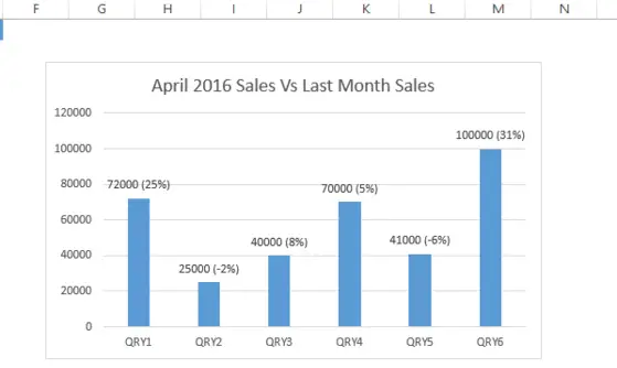
Extra information is now added to the chart labels below. In this chart, there is not only current sales, but also that QRY1 is up 25% vs last month’s sales. Nice. Let’s create these labels then!

Let’s Create The Added Value Chart Data labels.
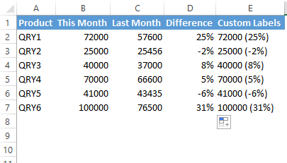
Firstly we need a helper column or two! These are custom Excel data labels. Some manipulation of the data is required. Below is the original data set for the Excel chart.

So, here is the same data set with two added helper columns D and E

Excel Chart Data Labels Using Formulas.
In Column D I added is the difference between April 2016 sales and the previous months sales, whereas in Column E is where I have my custom labels that appear on my chart.
The Formula is D is a standard % difference formula, taking the difference between the two numbers and dividing it by the original number. The full formula is in the screen grab below.

Finally, in Column E, I used the CONCATENATE Function to join the sales figures from April 2016 and add the resultant percentage difference between April 2016 and the previous month’s sales figures (from Column D). The result is the custom Excel data labels I need. The full formula used is in he screen grab below.
You can check my blog posts for more information on CONCATENATE and here for CONCATENATE for NUMBERS & PERCENTAGES.

Time To Create The Labels.
So, now it is time to generate the custom labels. The label generation is now a manual process, but it is worth it for those charts. Usually, real estate space on Excel charts is of a premium, and you want your chart to tell visually as much of the story as possible. Follow the steps below to create the custom data labels.
- Select the chart label you want to change.
- In the formula-bar hit = (equals), select the cell reference containing your chart label’s data.
- In this case, the first label is in cell E2.
- Finally, repeat for all your chart laebls.

If you are looking for a way to add custom data labels on your Excel chart, then this blog post is perfect for you. We will walk through how to create formulas that can be used in the future to quickly and effectively label any charts or graphs with specific information. So, if you need an easy way of adding extra context when presenting your data visually – read on!
Have you ever used these types of charting labels? Let me know in the comments below.
More Excel Tips.
Dont forget to sign up to the Excel at Excel Newletter for THREE free Excel hacks every month. Just click on the Sign Up Form to the right or use the link below.

