Happy Friday Excellers, you are probably thinking two things here as you have read the title of the blog post…..
- We can’t use conditional formatting in charts
- I thought this was a Formula Friday blog- so where is the formula?.
Well, conditional formatting is not available as such in Excel for charts, and yes there is a formula involved here so let’s get started on making an awesome chart.
Conditional formatting in Excel is great for highlighting important trends in your data and visualisations that you want to convey to your audience. We cannot however use ‘conditional formatting’ in Excel in the traditional way in charting but with the correct data set up we can trick Excel into formatting the chart based on conditions we specify.
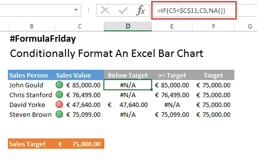
So let’s say you have data set set up as in the example below, which shows which sales people met their monthly target and which ones did not.

You now want to display this data in an Excel bar chart highlighting the sales people that did and did not meet their target. You want it to look like the chart below, with those not meeting target in Blue and those meeting target in Green. The secret is in the data set up and we need to amend that source data.

Set up some new columns in your data set as below. Somewhat like helper columns.

For the first new column, we want to identify any records that have NOT met target or are below target. We do this with the IF function as below:

We use a simple IF function. The Syntax being
IF( condition, [value_if_true], [value_if_false] )
The formula checks the sales value in our first sales value cell, and if it is below Target, Excel displays the value in the column, if the value is not less than the target then #N/A IS entered into the cell.
We repeat the IF function in the >= Target Column with the function

The formula checks the sales value in our first sales value cell, and if it is greater than or equal to Target, Excel displays the value in the column, if the value is not greater than or equal to Target then #N/A IS entered into the cell. So that is our data set up. Next let’s create the chart.
- Select your data set
- Insert Tab
- Charts

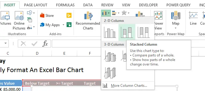
- Insert column chart
- 2D stacked column chart

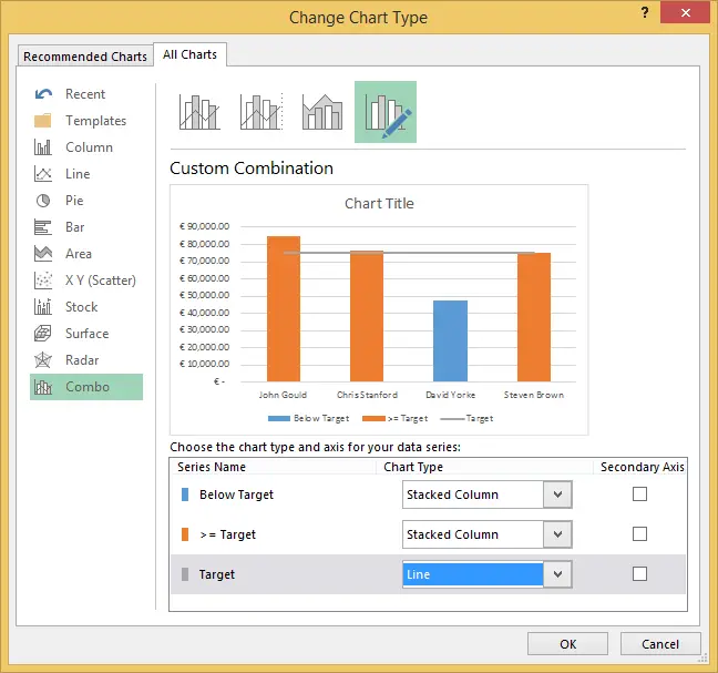
- Right Click on the Target data series
- Change Series Chart Type – Combo (Excel 2013)
- Select the Target data series and change to line chart

- Hit Ok
- Next we can change the colour of the data series to suit our preferences
- Click on the Below Target data series
- Series Options – Fill and Line
- Solid Fill and select your colour
- Repeat for the Equal or Greater than Target data series and select colour
- Add Title to the chart and format how you wish further

There we go, a conditioanlly formmated chart. Nice one. Have you used this methosd for formatting charts?.


