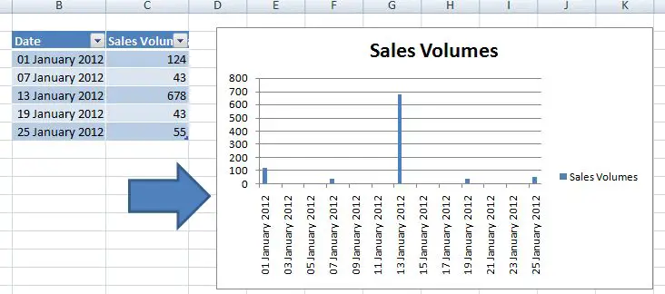
Gaps can be good, – sometimes – but not always on the Axis of your Excel chart. I think it looks like something is missing somehow or just downright untidy. A bit like my example here below.
Nasty nasty chart.
I usually find that things like this happen when my data set is looking at week commencing intervals or the first day of the month and Excel assumes that there are a number of days missing form my data set when in fact there aren’t at all.
The trick with this is to trick Excel into thinking that there are not days missing, we do this by getting Excel to treat the data in question as plain old text.
It’s easy to do.
- Right click on the x axis
- Select Format axis option
- On the Axis Options menu change the Axis Type from Automatically select based on data to Text axis
- Your graph will now look less ‘gappy’ as the dates category is now assumed to be not a dates in a time series but text
After applying these settings your graph will look more compact and professsional.
![]()
![]()
Other Top Excel Tips You May Like
1. Shorten The Y Axis Labels On Your Excel Chart
2. VIDEO-How To Delete Obsolete Items From Pivot Table
3. Mix It Up With Combo Charts!
4. To Merge Or Not To Merge That is The Question


