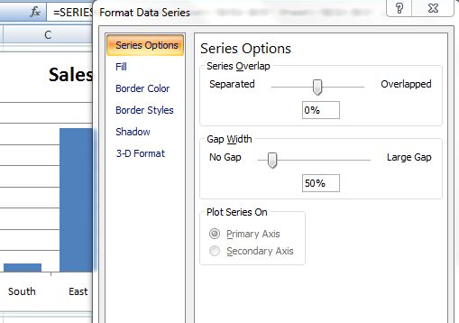
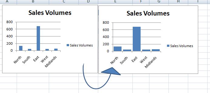
The default settings for bar chart in Excel mean that they appear on your charts with a lot of space between them. This default setting is sometimes not the look we want for our charts in particular if we want to compare the bars against each other. To have them appear closer together or of a thicker width would be better. It also will reduce wasted white space on the charts. It’s easy to do this in Excel.
- Right Click on the bars
- Format data series
- Series Options
- Gap
- You will see a slider
- Slide left or right to change the % width between your bars

This will adjust the width of your bars making them closer together or further apart.
Other Excel Tips You Might Like
1. Create Combination Charts In Excel
