In this Excel tutorial, I show you a straightforward but powerful technique to incorporate a dynamic horizontal target line into your Excel chart. Whether you are tracking performance metrics, comparing actual values to targets, or simply wanting to highlight a specific threshold, this method will empower you to create informative and visually appealing charts.
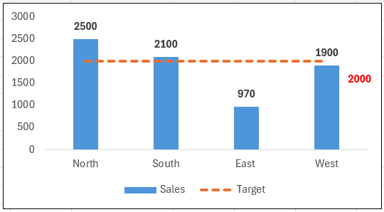
I will walk you through creating the Excel chart below with a fully dynamic target line.
Many users will manually type the target into the Excel data set and enter repeating values for each sales area. However, with my method, you set the target line once in your Excel data set and that is it. No more updating is needed unless your targets change. You can effortlessly update your target values with one cell change, saving a lot of time and effort. I usually place my targets next to my main data set for ease of reference and visibility.
If you want to download the Excel workbook, click the link below to follow along. Alternatively use the workbook as a template and add your data to have your target lines. Let’s dive in, and I will walk you through the process.
Setting Up Your Excel Chart.
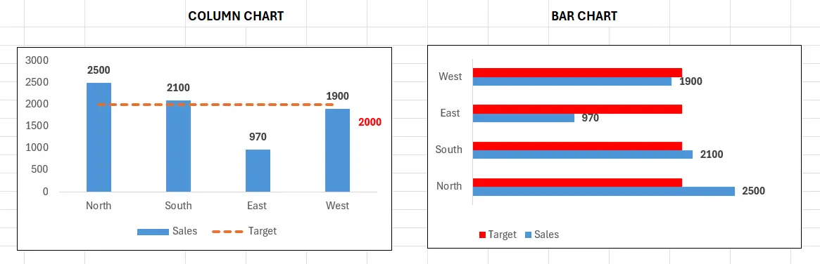
So you are adding a target line to your Excel chart. Am I correct in making an assumption that you are familiar with creating charts?. Awesome if you are, but if not, let’s create one in a few clicks. It is easy to up a column or bar chart. What is the difference between the two types of charts?. A Bar chart displays your data horizontally, whereas a Column chart displays your data vertically. You can see the difference below.
To create a Column chart or a Bar chart, you can either select all of the data or put your cursor in the data area you have and follow the steps below.
Insert Tab | Chart Group | Insert Columns Or Bar Chart | Select either Column or Bar Chart.
An even faster way to create a column chart is to select anywhere in your data area or table and press ALT+F1 together. Please give it a go. This shortcut is my go-to method if I need a quick Column Chart. The column chart will provide a rough and ready chart with a click. You may need to update it to suit your style, but what is not to like for such a quick solution? Now that we have our chart, let’s insert the dynamic horizontal line.
Setting Up The Dynamic Target Line.
The dynamic line will be a target across all sales areas, but instead of manually typing my target against each of the individual sales areas, I have set up a data area to store it. You can see the target of 2000 is set in cell C10.
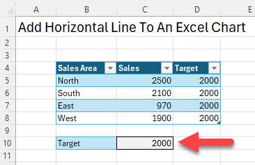
So, how do I get that target into Target column D without manually typing and updating the target if it changes? It’s very easy. Select the first cell in the data set and type =C10. DONT FORGET to make that cell absolute using the F4 key =$C$10. This wraps the cell reference in the $, ensuring that when we drag down the formula it remains referenced to C10.
After completing the above step, test the target value to ensure it is dynamic. Change the value in C10 from 2000 to 2500, and all of your target cells in the sales areas will update automatically. How cool is that? It is now time to add the dynamic target line to our Excel chart.
Add The Dynamic Horizontal Target Line To The Excel Chart.
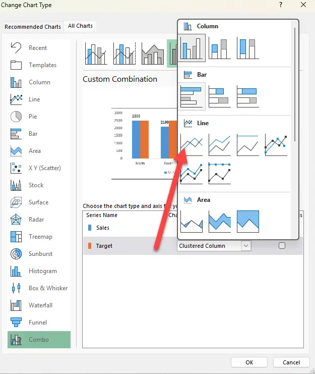
You should already have the basic column chart created; if not, go back to the section above on Setting Up Your Excel Chart. Once you have your basic chart, the target line is added as a new data series. To do that, follow the steps below.
Right click on the targets data series on the Excel chart. | Change Series Chart Type | Change the option for Target To Line. | Hit ok.
We can further play around with the data series. I want the target to be a dotted line, so click on the data series, and this where you can access a lot of customisable options. I have chosen dotted line from the line options. Also, I need one data label to the far right. Right Click to add data labels, then delete all of the labels not required. Your chart should end up like my chart below.
Adding a dynamic horizontal target line to your Excel chart is a simple yet powerful way to highlight key targets without manually adjusting data each time your goals change. By linking your target value to a single cell, you ensure flexibility and efficiency in your charts, making updates seamless. I hope this tip helps streamline your workflow and improves your data visualization!
Let me know if you’d like any tweaks!
Related Links.
Want to watch the Video?. I have a You Tube Video showing you step by step how to add your dynamic target line. You can watch it here >https://youtu.be/4ondMCO_NUU
