Sales Funnel or Pipeline charts are increasingly used in Business Intelligence packages and are part of data visualisation on dashboards on a regular basis by most businesses. Even though they used regularly they are not actually pre built into Microsoft Excel.
So how can we create one if we use Excel?. With a bit of creativity and the use of the Stacked Cone Chart you can create a Funnel Chart to suit your requirements which your boss should be happy with.
So let’s go ahead and create our own Sales Pipeline or Funnel Chart- In Excel.
These step by step instructions are applicable to Excel 2013 onwards.
Please note… Do be careful with these charts, they can be slightly misleading with regards to the data as the area of each section may not represent the data proportionally to other sections within the chart.
So, Funnel or Pipeline charts are normally used to represent the numerous stages of ‘sales leads’. Usually you will see a trend of reducing values at each of the different stages of prospects as they work their way through the pipline. i.e you may have a large quantity of leads at the start of your sales campaign, which will reduce in size as they progress through your funnel, depending on your success on gaining new business from the leads.
The usual stages of sales lead prospecting are-

Prospecting – Appointment – Presentation – Quotation – Negotiation
So let’s go ahead and build a Funnel or Pipeline chart in Excel Excel 2013 onwards with a working example.
Our data below shows the sales leads at various stages with the number of sales leads

So let’s go ahead and build the Funnel Chart…..
- Highlight your data range and then Insert a normal 3-D Stacked Column Chart.
- Switch the rows and columns

- This stacks your chart.

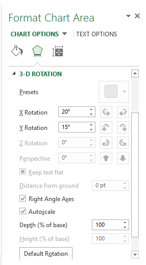
- Now to get rid of the 3D effect-right click your chart. You will see 3D rotation- change the x and y settings to 0

- We now need to tidy up the chart…….
- Delete the vertical axis values if you want to to neaten up the chart- right click the axis-axis options-labels
- Select None.
- Next we need to change the chart to a Pyramid
- Right click the data series
- Select Full Pyramid option
- To invert (or turn upside down) your Funnel if you wish to- right click on the vertical axis and under Axis options select Reverse In Order

- To add data labels to the chart- click on your chart- Chart Tools-Design- Add Chart Element- More Data Label Options and select the type of data label

- There you go a Sales Funnel Chart in Excel!!.
I like to create a Funnel Chart, and then keep the framework as a template for future use. Its just a lot quicker, I just rename my template Sales Funnel Template or something to that effect.
If you want to know how to create an Excel Template then you can check out my blog post right here.

4 Ways To Add Data To Your Excel Chart
Quickly Paste Extra Data Into Your Excel Chart
Change Your Default Chart Type
5 Reasons You NEED To Know How To Build Excel Dashboards
