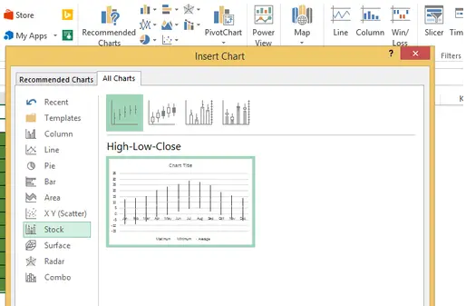
I do not see these charts being used much – except for stock market ones but high low close charts are really useful where you have three data series like high, low and average data to show. The average data series replaces the closing that appears in stock charts.
Here is a great example. I have some temperature data for Ireland from 1962 to 1991. I have the highest, lowest and average monthly temperatures for that period.
To create the chart
- Select your data – including all of the data series and labels
- Insert – Recommended Charts – All Charts – Stock Charts – High Low Close
- Hit ok and Excel will create your basic chart. We just need to to make some small changes- it doesnt look great at the moment.
- Add a Title to the Chart- I have chosen Maximim- Minimum and Average Monthly Temperatures Ireland 1962 to 1991.
- The Axis labels are not in the right place for me, right click on the months – Format Axis
- Labels – Label Position – Low
- I want to remove the legend – Right Click and Delete – the chart looks a lot better
- Remove gridlines – Right click on the Gridlines – Format Gridlines – Line – No Line
- Now we need to make the average temperature data series pop a little more
- Right click on the average data series – Format Data Series – Fill and Line – Marker – Marker Options
- Select the Marker type. I have chosen a red square – play around with your options
I have used charts like this to display the maximim and minium prices of goods and also an average price.
Have you ever used these types of charts for anything other than stocks????
4 Ways To Add Data To An Excel Chart
Easily Paste Extra Data Into Your Excel Chart
Change Your Default Chart In Excel
Add A Trend Line To Your Excel Chart
Create Dynamic Titles In Excel Charts
If you want more Excel solutions to formulas and charting then I recommend
A structured and comprehensive online training program for learning Microsoft Excel. It is full of real world examples to work through.


