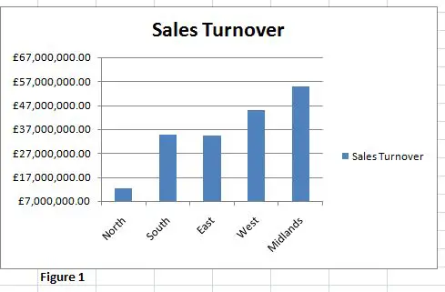
This really was something that annoyed me until I found out how to fix it! If you have large numbers on your Y axis it can take up waaaay too much space.the sales here may be good but the Y Axis labels are most definitely not.
See Figure 1 below.

The Axis Labels are very long and are taking up too much space for this graph. Whilst you could put up with it, I would rather my graph have a larger data are to show all the good data analysis and comparison stuff, and reduce the space taken up by my labels.
So, here is is how to change the Y Axis label length.
- Right-click the Y axis (try right-clicking one of the labels) and choose Format Axis from the resulting context menu.
- Choose Number in the left pane. In Excel 2003, click the Number tab.
- Choose Custom from the Category list.
- Enter the custom format code £0,,\ m, as shown in Figure 2. In Excel 2007, click Add.
- Click Close (OK in Excel 2003) to see the custom format at work (Figure 3).
Figure 2
Figure 3.
This is a great formatting tip, go ahead and play around with the different formatting and make more room on your graphs and charts.
Other Excel Charting Tips You Might Like.
1. Create A Self ExpandingChart In Excel
2. Change the Width Of Bars In Your Barcharts
3. Want To Mix It Up? Create Combination Charts
4. Probably THE Simplest Dynamic Chart In the World

