Typically most people create charts with one style such as a column chart, a line chart, or a pie chart. If my chart has more than one data series for example monthly targets and actual monthly sales, you may sometimes want to display these as multiple styles on the same chart.
This is where a combination chart is really useful. Combination charts are not available on the Excel ribbon (Excel 2007)
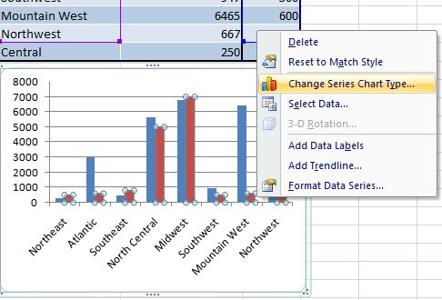
I have used the scenario of the targets (projected sales) and actual monthly sales for an example below. The first step is to create your chart with two data series as normal.

- Click the series you want to change ( I am changing the sales targets- the third column of my data set)
- Chart Tools
- Design
- Type
- Change Chart Type
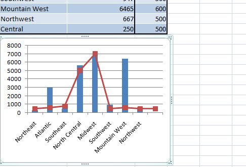
- Choose an icon that you want to change the data series to. In my example that is a line chart

The example chart chart started out as a standard column chart an a few clicks later a smart and more appropriate combination chart is made. Sit back and have a coffee- well done!.
A few chart types can’t be combined- for example a bubble chart or a 3D chart, but as usual with Excel of you try to choose an incompatible chart type it will let you know!.
More Charting Tips
1. Create a self expanding chart
2. One click super quick chart
3. The simplest dynamic chart ever