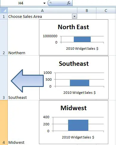
There are many ways to create dynamic charts in Excel, but today I want to share with you one of the most simple. In fact I think it is THE simplest way I think I know to create fun simple but impressive dynamic charts.
Let’s for an example say we want to show sales figures for widgets for three months .
- First of all create a data set with some sales figures. Use the download the example template at the end of the post if you want to.
- Create three standard bar charts one for each month.
- Name three corresponding cells with your month names
- Change the cell heights in each of the cells- this is where your graphs will sit.
- Next put a simple filter on your cells to show your months sales.

Click away on the filter, sit back and enjoy!!!

There you have it a really fun, quick simple way to create a stunning interactive dynamic graph in Excel.
Go ahead and give it a go impress your colleagues.
Download the template and example workbook right here.{filelink=2}
You may also like these posts on Excel Charting.
1. Create a self expanding chart in Excel
2. One Click Super Quick Charting
How do you rate this technique for creating dynamic graphs compared to the alternatives using the Index()function?.